Thursday, June 7, 2012

More cards

I guess I'm really working on cards right now.  The first one today was a birthday card for my husband.


I picked 3 coordinating colors from Stampin' Up and sponged them on.  The stamp is from SU's Lovely as a Tree stamp set.  I used an aluminum can and punched it with SU's Modern Label punch.     Added some brads and put Stampin' Dimensionals on the back.  He thought it was great!

Next I made some Father's Day cards for my dad and father-in-law. 

Yes they're pretty much the same.

To begin, I didn't get pictures of the first part.  I had my husband help me.  I cut open an aluminum can and had my husband measure and cut it for me with scissors.  While he was doing that I measured the rest of the paper and got it ready.  When he was done I put each piece in an embossing folder and ran it through.  I glued it down where I wanted and then glued the paper pieces down.  Since it's hard to cut them straight I overlapped the top and bottom with the paper instead of the other way.  Next I used the Cricut and using the Crikits pens for the words, using the metallic grays. Then I picked out the cutout and frame and marked the center point and for the square cutout.  Using the same paper I also cut out the frame ¼" larger than the square (not real dial size).  I then used Sahara Sand ink pad from Stampin' up and placed the frame face down on the pad.


Using a stylus I pushed the frame into the ink.


If you like you don't have to do the whole thing, but that's what I wanted to do.


 Next I took the square with "Happy Father's Day."

Before
 And sponged the sides with the same color of ink.
After 
Then I glued the square on top of the frame, if you prefer you can glue the frame on top.  I punched holes on the sides and inserted brads and added Stampin' Dimensionals to the back.


And placed it on the card.


Hope you enjoy!  Thanks for visiting!

Tuesday, June 5, 2012

Mother's Day 2012

So I meant to post these much sooner, but here's some Mother's Day items.

First a gift for my mother-in-law:


I bought a pot and saucer and painted them with an outdoor pottery paint.  Print your photos out on regular printer paper in black and white.  I printed pictures in a lot of different sizes and then used Modge Podge to apply them.  Remember the top of the pot is wider than the bottom, you'll have to decide which pictures you'll want layered over other ones.  Make sure you smooth all the bubbles out.  After this dries, add a crystal clear enamel or acrylic spray.  Add some beautiful flowers and there you have a great present for the grandparents.


Our cat had to check out the flowers.


Now I move on to a Mother's Day card for my step-mother.


I used the wallpaper embossing paper folder from Stampin' Up.  I also used Sahara Sand ink pad from SU and rolled it onto the folder with a brayer before embossing it.  I used the Cricut machine for the cutout and layer.  I added pearl embellishments and tied a ribbon added by glue dots.

That's it for today. Thanks for stopping by.

Thursday, May 17, 2012

Cards

Sorry I haven't posted in awhile, haven't been feeling well.  So, thought I'd post some pictures of some cards I've made recently.

This first one was a birthday card for my daughter.


I used the Stampin' Up Petals-a-Plenty embossing folder and then used pink chalk on the embossed flowers for a light touch.  The cutouts and flower are all from Cricut except the leaves that were cut from Spellbinders Shapeabilities Foliage.  I also curled them around a little for a more 3D effect.  The butterfly was made from blue vellum paper and I only glued down the middle again for the 3D effect.

This next one was made for my mother-in-law for Mother's Day.


This one I used Stampin' Up's Manhattan Flower embossing folder.  After embossing I decided to sand down the embossed flower to show the white of the paper and then decided I would try for a vintage look and I started sanding the sides of the paper.  I ripped a couple of the corners and made some tears, took a little while, but I liked the look when I was done.  I cut the "mom" out from Cricut's Beyond Birthdays and then added a cameo charm that I bought from a craft store.  I used a glue dot to apply it and told my mother-in-law that if she'd like she could remove it to use it as a charm.

This next one was for my husband for our anniversary.


All the papers and stamps were from Stampin' Up.  I used the dragonfly from their Nature's Nest, the vines from Elements of Style, and the LOVE you stamp from Sale-A-Bration Sprinkled Expressions.  The ribbon came from a local craft store and although the picture doesn't quite capture it, it matches the color (Island Indigo) of the dragonfly.  I also took some Bravo Burgundy and sponged it on the edges of the white squares and the heart to give some distressing to it.

Well, there's 3 for now.  Hopefully will get back soon for some more crafting.  Thanks for stopping by.

Tuesday, April 24, 2012

Hi!  I'm T.C. and I love to do crafts!  I thought it would be fun to start my own blog and share my own ideas, inspirations, and crafts with you.

For my first blog I thought I'd share with you my alphabet art creation.  First, instead of using everyday objects, I used people.  Actually, for this one, I used children.  More specifically, the grandchildren for whom this was made.  I tried to make sure each of the children were used the same amount of time.  Except the little one was too squirmy, so we only got her a couple of times.


To start, decide whether or not the "models" will be standing or laying down or a combination.  Round letters are harder to do standing up.  Mine were lying down on a sheet, however, the sheet isn't necessary (I wasn't sure what I was going to do yet).  I used a ladder to get a better view, so the letters weren't angled.

Here's a picture of the boys making the letter "O."


Also, a trick I used, the 'squirmy' one wasn't willing to lie down with the others too well, so we snapped pictures of her separately and then placed her in the photo through photobucket.com.

After taking all the photos of your letters you will need a background picture.  I searched on the internet for backgrounds until I found one I liked, the blue bubbles, which was actually green when I found it.  You can use photobucket.com (they also have backgrounds you can use) to change your color.  Upload your background, choose to edit it, then adjustment,  color, and make your changes from the choices.  Or you could also photograph your own background.  Just remember when choosing one from the internet, if you plan on selling your creations that you make sure there are no copyright infringements.

Upload your pictures to photobucket.com.  Next choose your background photo first and choose to edit it.
Choose the adjustment button and resize and make note of your width and Height of your background.  You want this to be the same size or bigger than you photos.  My photos were much bigger.  So if yours are like mine choose them to edit and resize each of them.  Make sure you save the copies to your computer.

Next, choose your background photo and choose to edit it again.  At the bottom of the page choose to use the advanced editor.  Choose the layer button and open image as layer (normally you would choose to open from library as image, but it's not working correctly.  This is why you need to make copies of the smaller photos to your computer) choosing one of your saved images.  Now you should have the 2 pictures layered.


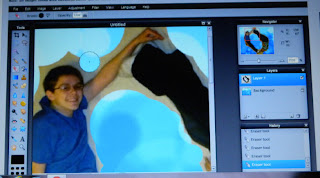
Choose the pink eraser button on the left side (5th button down).  Above your picture is your brush size and the opacity.  I prefer 100 opacity.  Brush size, use the biggest one you can without erasing your "letters" and then work down to smaller brush sizes.  If you make a mistake you can always hit the edit and undo buttons.  This does take time and patience, but when you get done, it's worth it.  Also, on the right is the navigator where you can change the zoom on you photo so when erasing you can really tell where you need to do it carefully.
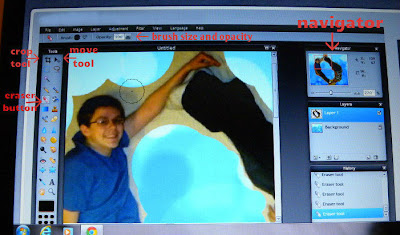
I've labeled some of the buttons for you.
Also note the circle, the next photo shows where I erased this with the tool.


When you are done erasing all the old background for the new one, click on the move tool (1st button on right side).  If you photo isn't centered now you can move it around.  Once you have them centered you will want them merged together.  Click on the layers tab again and choose merge visible.  If you want you can also crop your photo here if the background is now too big all the way around or just on the sides.  Use the crop tool next to the move tool to crop.  It'll have you make a box of the part you want to keep.  You can move this around after making the box if you didn't get it quite where you wanted it.  Drag on the little blue squares in the corner to resize.  When done, click the crop tool again and it will ask you to confirm your changes.  Make sure you save your new picture (File tab and then save).  Do this for each of your letters until all are done.  Again, this does take a lot of time, especially if you have a long name to do.
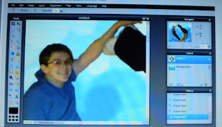
This one is blurry because it is so zoomed in, but this is the way to really get in and erase the background.
I printed mine out, but you can have them printed by your favorite photo place.  Some places like Michael's sales frames pre-matted for the alphabet creations.  However, they didn't have one big enough for the last name I did, so I placed them on a mat myself and framed it.


Hope you enjoyed my first blog.  Thanks for stopping by. ~ T.C.